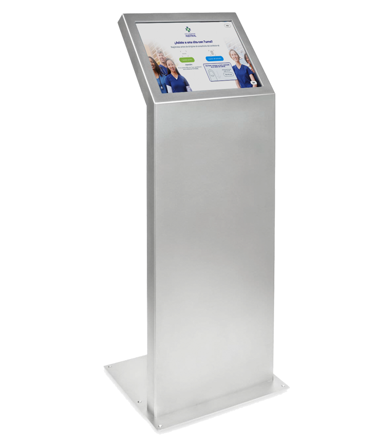
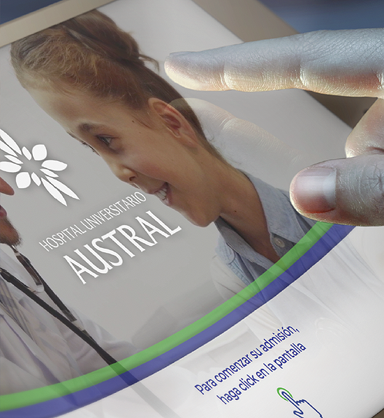
Hospital Universitario Austral
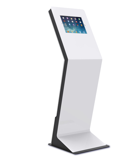
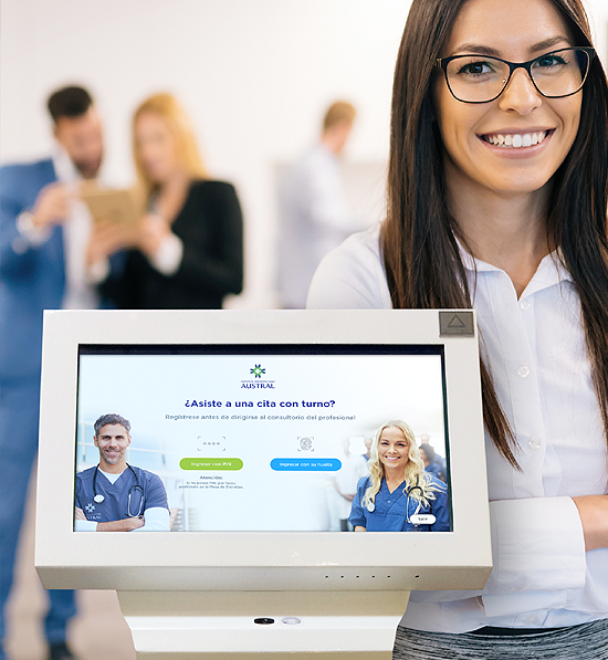
Totem Display:
Usability Project

From digital concept idea to market release
The purpose of this project is to analyze, understand and evaluate the behavior of the users participating in the experience: end users (patients) and staff (Receptionists), discover faults and areas of conflict, evaluate them and generate ideas and solutions continuously, putting them into practice.
THE PROJECT
Index of Contents.
- Executive Summary
- Initial Objectives
- Methodology
- Participants
- Field work (user behavior, wayfinding)
- Questionnaires, observations, videos, photos
- Statistics
- Current performance
- Errors detected
- Pains & Goals
- Survey results
- Conclusions and objectives
- Ideation
- Proposals and Generation of Solutions
- Creation of wireframes
- Design of support communication pieces (videos, demos, banners)
- Testing
- Goals and tasks
- Testing of prototypes with users
- Analysis, adjustments and validations
- Totem Navigation
- User Journey screens
- Final design assets
Executive Summary
Completed tasks
- We carried out a field study with the users involved: End Users (Patients) and Admissions Agents of Entrance / Reception Desks. Observations were made in the field in front of the totem and data on satisfaction of its use were collected through questionnaires.
- Face-to-face surveys were taken to obtain information about usability, interface design, and information flow.
- The information obtained from the field work was analyzed and creative proposals were made to the problems stated in the form of prototypes.
- Usability tests of the prototypes were carried out with 5 people, evaluating difficulties and improvements in the process. considered and validated said adjustments prior to the final development.
This report includes a description of how we carried out the research work in the field, the problems we encountered, the ideas to solve them, our recommendations, and how we executed them in the development of the final product.

Initial Objectives
On the research:
- Test the product with real users: This allows us to take a real dimension of the current state of the circuit to be evaluated and to be able to make metrics with specific data.
- Identify current usability problems and look for alternatives to solve them.
- Measure the current performance of the tool and the degree of user satisfaction.
On the tool (totem):
- Discover and adjust flaws in usability, interface design and information flow.
- Improve and clarify the communication of content to the end user
- Improve the ratio of users who complete the process through the totem, reducing queries through receptionists.
- Improve registration times using the totem.
Methodology
Participants
We carried out field work with the users involved:
End Users
They are the ones who interact directly with the totem by entering their data and who are admitted, confirming a appointments previously managed on the web.
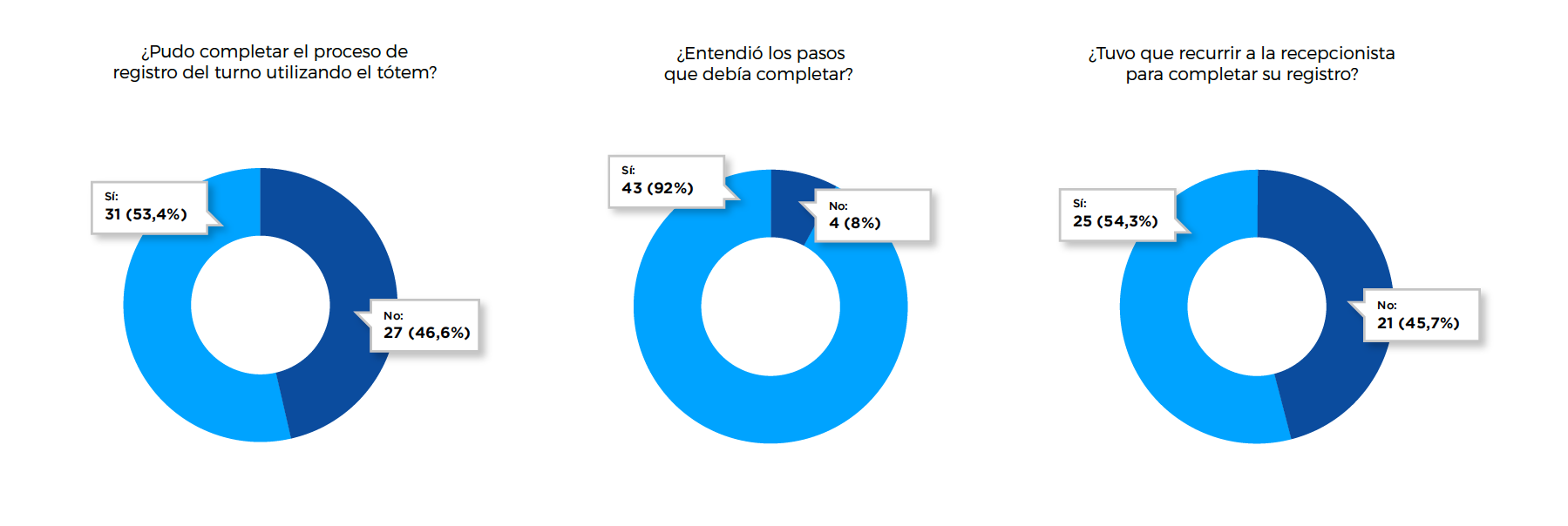
In this work we carry out user observations in front of the totem, analyzing reactions, management times, reactions, behaviors and current effectiveness of the tool (percentage of transactions completed successfully or not).
In cases where the end user turned to a receptionist to complete the process, we delivered a short questionnaire to explain why she had not been able to complete the self-admission.
The experience of 50 respondents was taken into account, who provided information by filling out the form on site, related to usability issues, interface design and information flow such as:
- Age range
- Experience Rating
- Degree of understanding of the process
- Completion of the process (or not)
- Complaints or recurring problems
- Advantages and disadvantages of the admission process
- Proposals to adjust the current system
Users eventually involved (Entrance / Reception Desk Admissions Agents):
They are the ones who initially provide support regarding the use of the totem, and in specific cases, personally assist in the completion of the Shift assignment process.
Work Plan
Description of task stages:
User Research
An investigation is carried out in the field on the users: Evaluation of times of the registration and appointments assignment experience. Questions to users and Mesa staff of Tickets. Behavior patterns. film records. Annotations.
Analysis
An analysis is carried out considering the problems detected and the possible solutions to each of them, along with the objectives to be met.
Ideation - Solutions
Meetings are held with the entire team involved (creatives, developers, directors) to evaluate proposals and select one. The scenarios with which to interact are analysed: (public space, media and flowUI). Use cases.
Prototypes
A prototype is made with the proposal of each piece: communication of pieces to develop (demo scripts, UI scripts, etc.), and the flow of Registry use cases and Shift Orders (UI Totem).
Testing
A test of the navigability of the UI is carried out, through the use of “people”: up to 5 actual users of the system. The necessary adjustments are made.
Production
The creative pieces evaluated (demos, posters, banners) and the graphic assets are produced of the flow of the totem in html5, ready to be integrated into the current system.
Initial Observations
We saw that currently, the figure of the receptionists occupies an important place within the admission process, since they act as support (when the user cannot interpret the process via the totem) or as an alternative route,
in cases in which the user does not manage to finish it.
Receptionists' predisposition to use the totem varies according to the location of the reception and the volume of work that is required of them: At the Entrance Desk on the Ground Floor, for example, the predisposition is high, since they act as the first contact between the patient and the Hospital. they feel important in this process and do not see with good eyes "that a machine does its job".
On the contrary, the receptionists on the upper floors, where bottlenecks are formed due to lack of space or because the totem refers the patient to finish their management in front of a counter, are the ones who most
contributions and suggestions provided to achieve improvements in the process of its use.
They understand that a good totem performance speeds up appointments admission management and allows them to focus on other tasks.

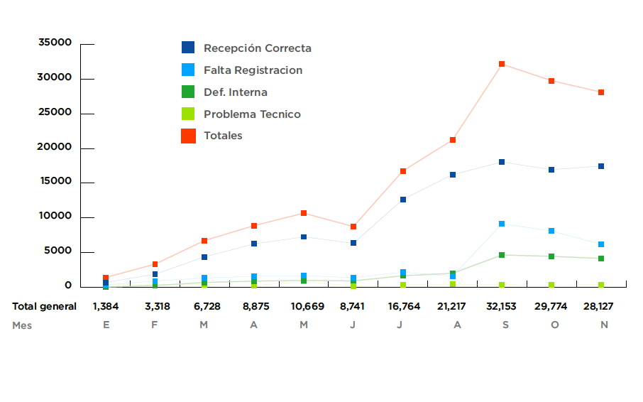
Statistics
Totem Performance
Period: 2018 - January to November
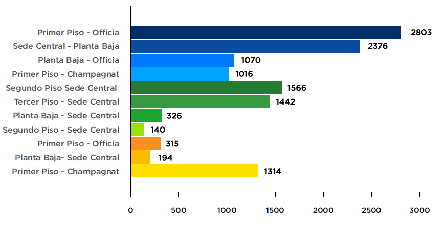
Totem Transactions
Period: 2018 - September / October / November
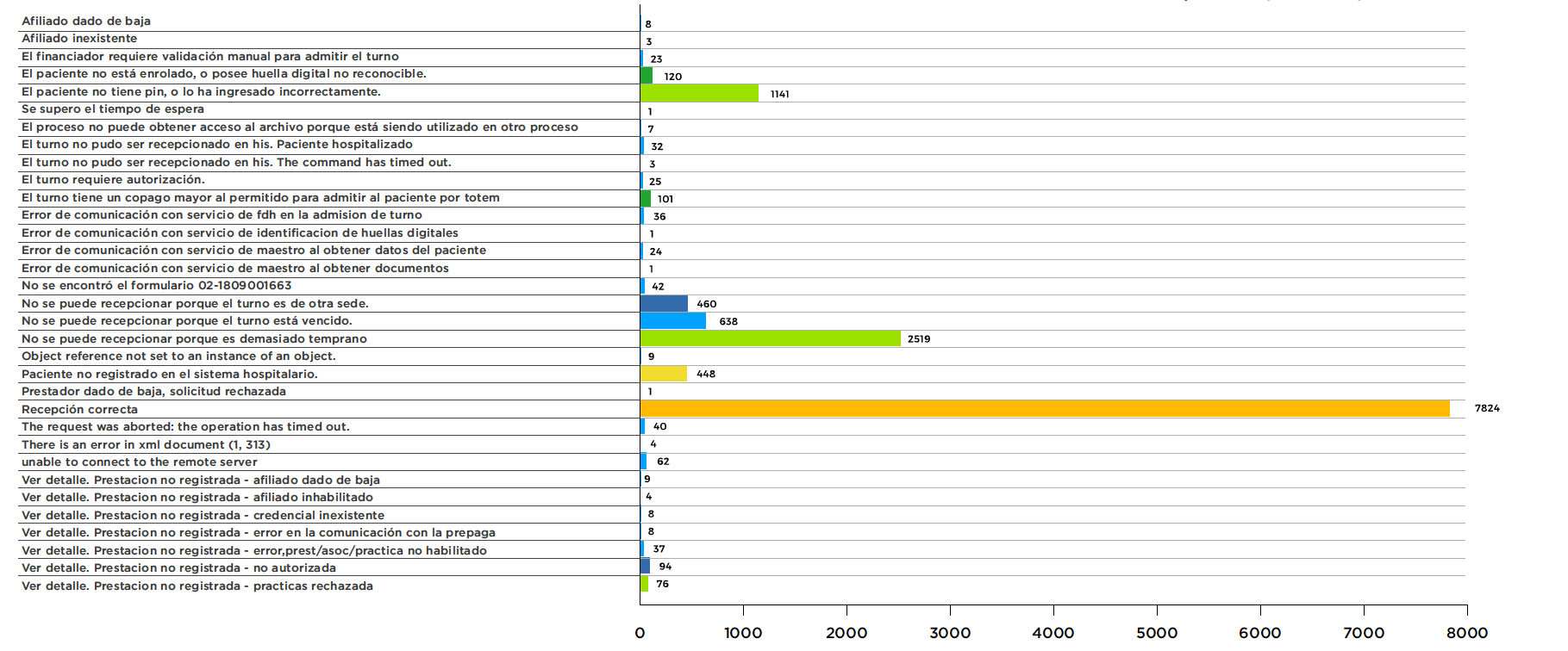
Logged messages and errors
Period: 2018 - September / October / November
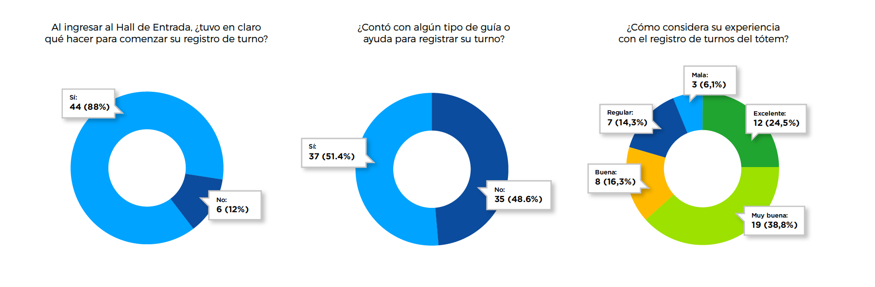
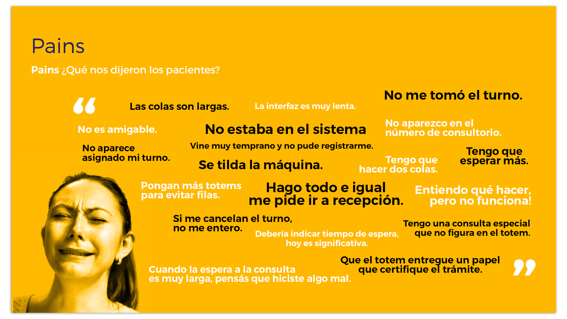
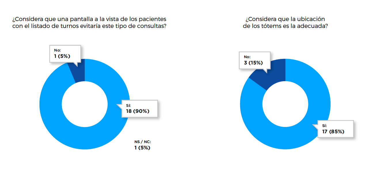
Pains
Results of the User Survey about their current experience in the Registration and Shift Assignment process
Universe: 50 people
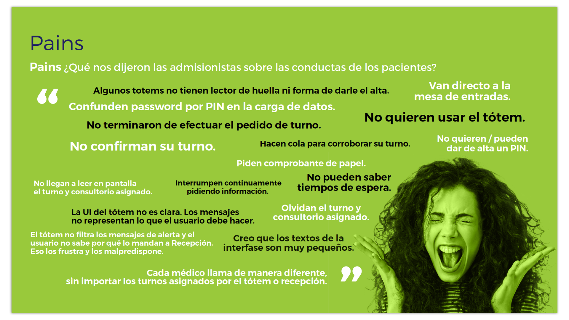
Pains
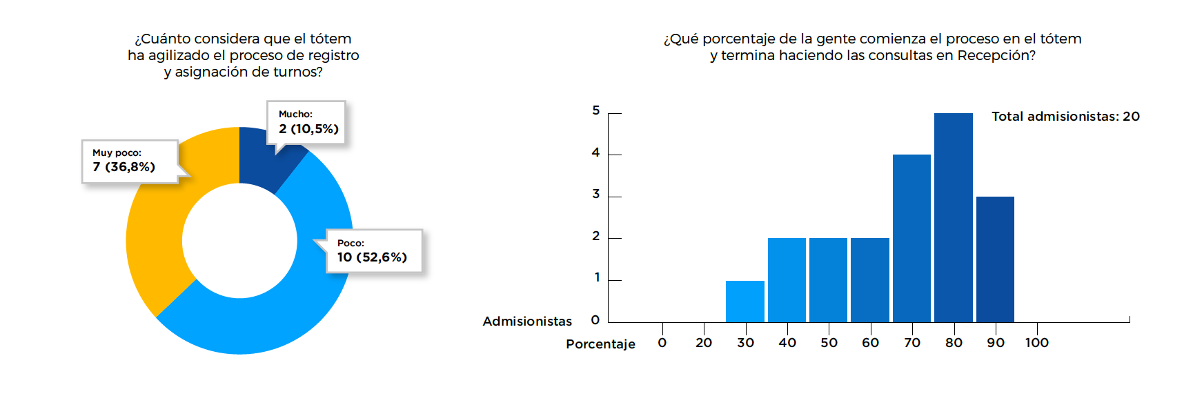
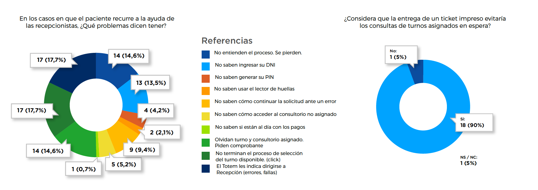
Results of the Survey to Admissionists about their current experience in the Registration and Assignment of Shifts process
Universe: 20 admissions
Goals
Based on the problems and conflicts raised, we define objectives to be met.

Optimize and streamline processes
This includes from the location of the totems (building a circuit where they are the first option to register) to the navigation of the interface and its performance. The process should be more intuitive. Registration should be more agile and faster.
Improve the graphical interface
The user must correctly interpret all elements within the interface. Both the elements or symbols and their layout should be adjusted and changed to avoid interpretation errors. Improve readability.
Rule of 3 clicks and content
It is not the number of clicks but the content and titles of the links that have a fundamental role in usability. Communication of content to the end user should be improved and clarified.
Other objectives to evaluate and contemplate
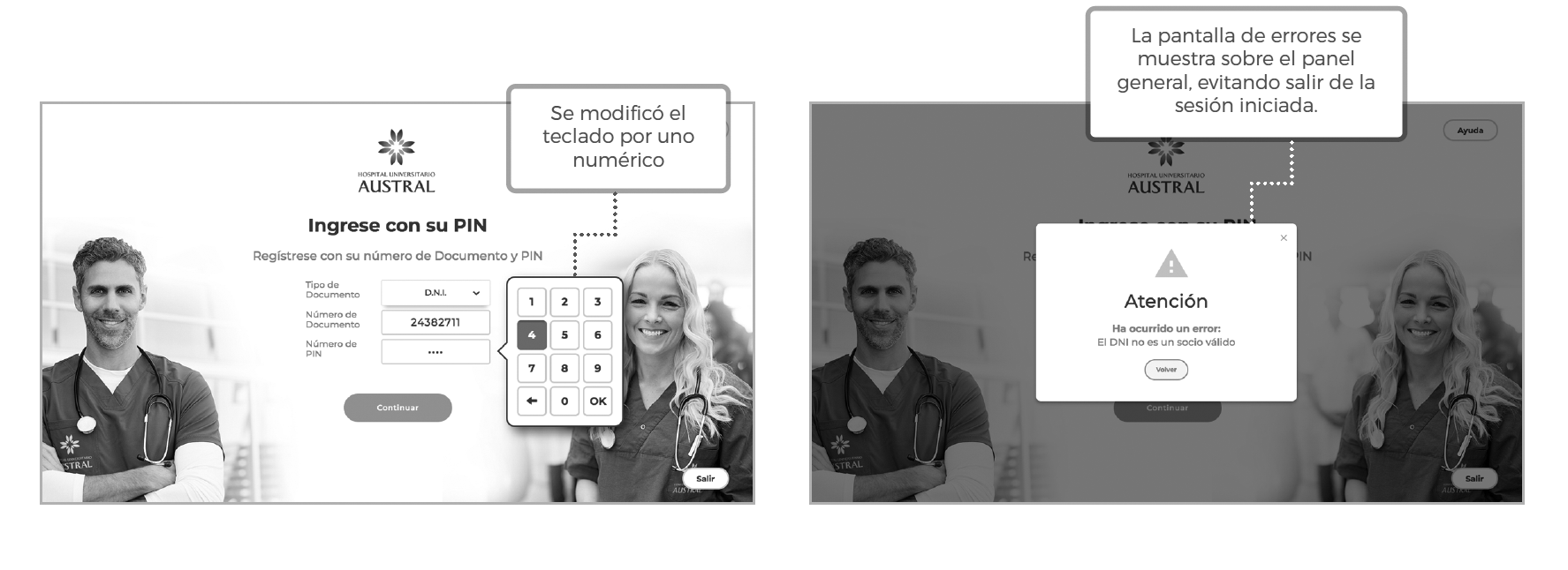
- Define a space for registering or resetting PINs:
- Nowadays, not all ticket desks have the possibility of resetting or registering a PIN.
- Extend the range of turn reservation time.
- Standardize the totems and their functionality:
- There are different types of totems and not all of them have fingerprint readers. This creates confusion. It must be defined if the fingerprint reader will continue to be used.
- Implement screens with lists of waiting appointmentss:
- View your order. Check the success of the transaction.
- Improve registration times.
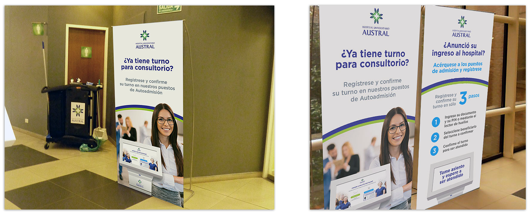
- Supplementary Communication Materials:
- Develop banners and demos of use to instruct patients in the processes.
- Implement ticket delivery:
- The patient would be calmer. The ticket serves as a reminder of the office and avoids queries at the entrance table. Patients don't ask How many people are waiting? It would avoid overloading the admissions officers with work.
- Prevent professionals from assigning special appointmentss (announcements) outside of system management.
- Improve system performance:
- to avoid completion of management with admissions agents and generate a double circuit.
Ideation Process
In this stage, alternatives were proposed for the redesign of the graphical interface and ideas to adjust and optimize the flow of the tool. Pain points were reviewed, evaluated and a final path was defined. Members of all areas of the company involved in the process participated in the brainstorming and solution selection process. Use cases were "acted out" and settings were evaluated.
Besides...
- We define new circuit alternatives for users/patients (wayfinding)
- rom entering the facility to their meeting with the doctor/professional, to reduce queries at the Ticket Desk.
- We design new alternatives for communication pieces:
- Twith clear messages, unifying the concepts and their visual aesthetics: banners, institutional videos and usage demos.
- We redesigned the flow of the User Identification:
- and Shift Assignment system of the totem.
- We developed an interface that contemplates the system already implemented in the totem:
- optimizing the experience of the existing use cases and their communication, and from the technical point of view, facilitating its integration.
Ideation Process: User Journey
Starting Point
Main Page
Appointments List
Appointment successfully assigned
Totem Navigation
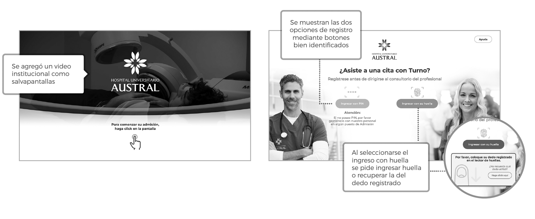
Taking into account the settings defined in the testing stage, the complete flow of the "users stories" of the totem was developed in html 5 responsive format (adaptable to any touchscreen or totem format) and css, and animations in javascript and Ajax were applied.
Videos for the screensaver and demos of the registration process and admission of appointmentss were embedded within the same code.
Contents were adjusted at the text and image level, facilitating the understanding of the steps to follow.
The elements and symbols of the interface were modified, as well as the fonts and sizes. All adjustments related to the "look and feel" were made based on current color standards and fonts.
Testing users
Once our prototype was developed, we proceeded to test it. For the sample, interviews were conducted with 5 people who represented the universe of end users, with their same needs, attributes, desires and behaviors. The recruited people had to fulfill a series of assigned tasks in two scenarios: the current one (in use) and the new proposal. In both, the same tasks were requested and performance and usability measurements and evaluations were carried out. The tested elements include colors, fonts, sizes, images, call buttons, location and content (texts, lexicon).
Behind each project of this type there is a "backlog": A list of product features generally defined as "user stories". These user stories define what users do about the product and how they interact:
As: user/patient
I want to: register to the system
to be able to: have an assigned turn with a professional.
Goals to meet
The moderator told each "person" the following goals:
Case 1:
Person: The user is the holder of a Family Plan.
Task: You must register using your PIN and
assign your daughter an appointment with a professional.
Case 2:
Person: The user is a patient.
She doesn't remember what print she signed in with.
Task: You must register and assign yourself a appointments with a professional using the fingerprint reader.
Tasks
1: Log in with PIN.
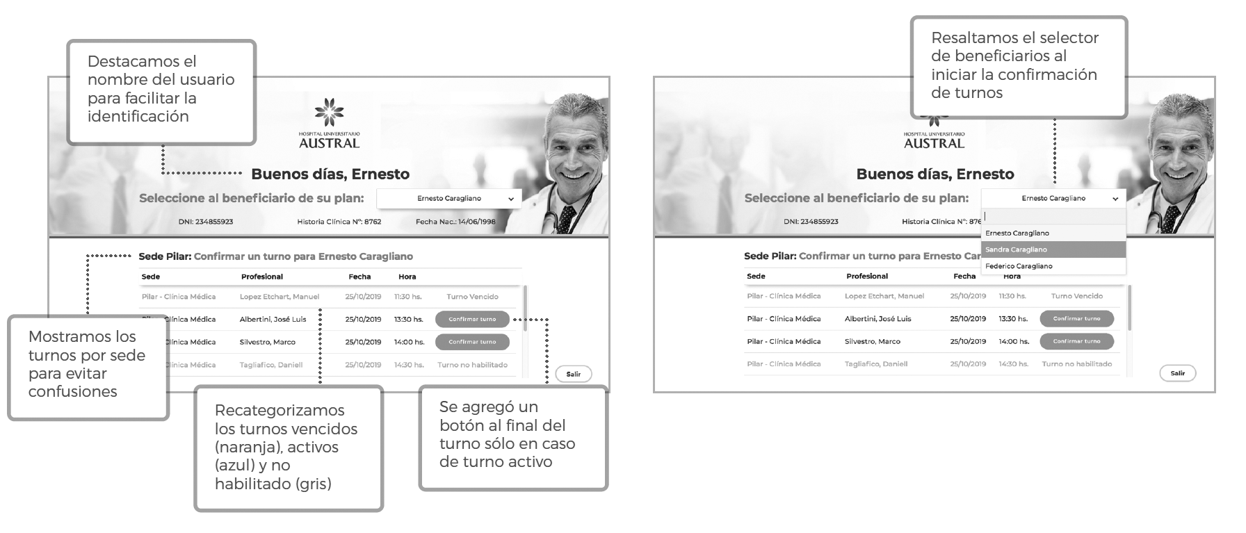
2: Select beneficiary (relative).
3: Select a appointments from the list.
4: Self-assign a appointments to the beneficiary).
5: Log in with fingerprint.
6: Recover the footprint.
Usability is the effectiveness, efficiency and satisfaction with which a product allows specific users to achieve specific objectives within specific contexts. The user can perform the task (efficacy), can do it efficiently (performance, accuracy), and can enjoy the task (satisfaction, stress, joy). The tasks and goals assigned in our testing contemplated these variables and apply them in order to measure them. As few as 5 people can help find up to 85% of current problems.
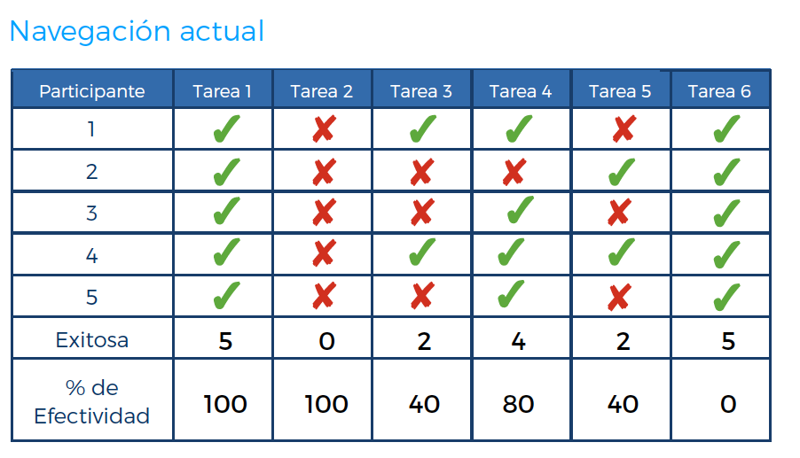
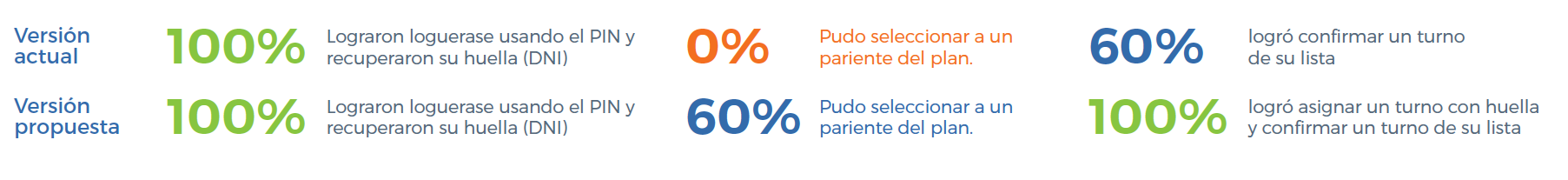
Results of the usability tests carried out on the current navigation and the new proposal
Current Navigation
Proposed Navigation
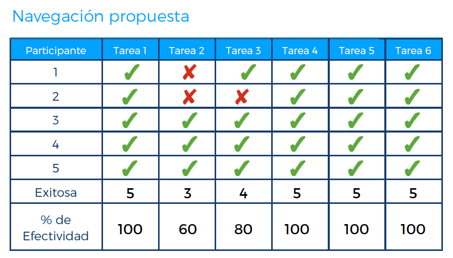
Evaluations and adjustments
Adjustments made
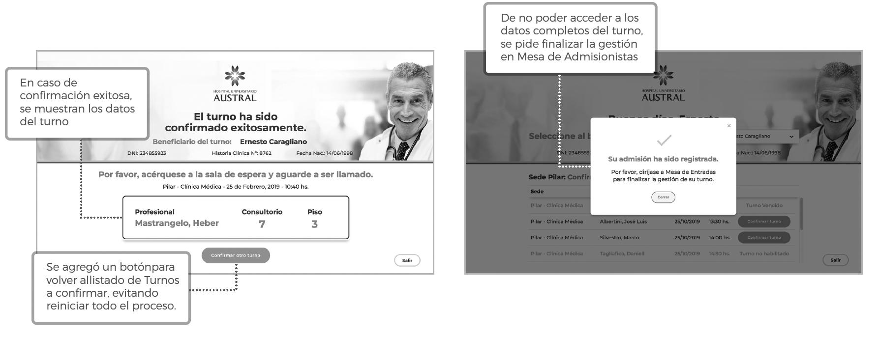
- Text sizes and many contents that were not clear were adjusted.
- A version without the fingerprint reader option was worked on.
- Work was done on the colored version to define buttons and look and feel.
- The reading of the patient selector of a plan was modified.
- The list of Shifts was adjusted and the possibility was added to be able to return to the list once a appointments has been confirmed.
- Initial images were modified.
- Adjusted button colors.
Initial page texts:
Are you attending a date with appointment?
Register with your Document number and PIN
Registration page texts:
Select the beneficiary of the appointments:
Confirm an appointment to:
Button texts "confirm".
Turn page texts:
The appointments has been confirmed successfully.
Text sizes.
UX design: Proposal files
Proposed communication pieces, wayfinding (totem circuits) and UI/UX design of the Totem
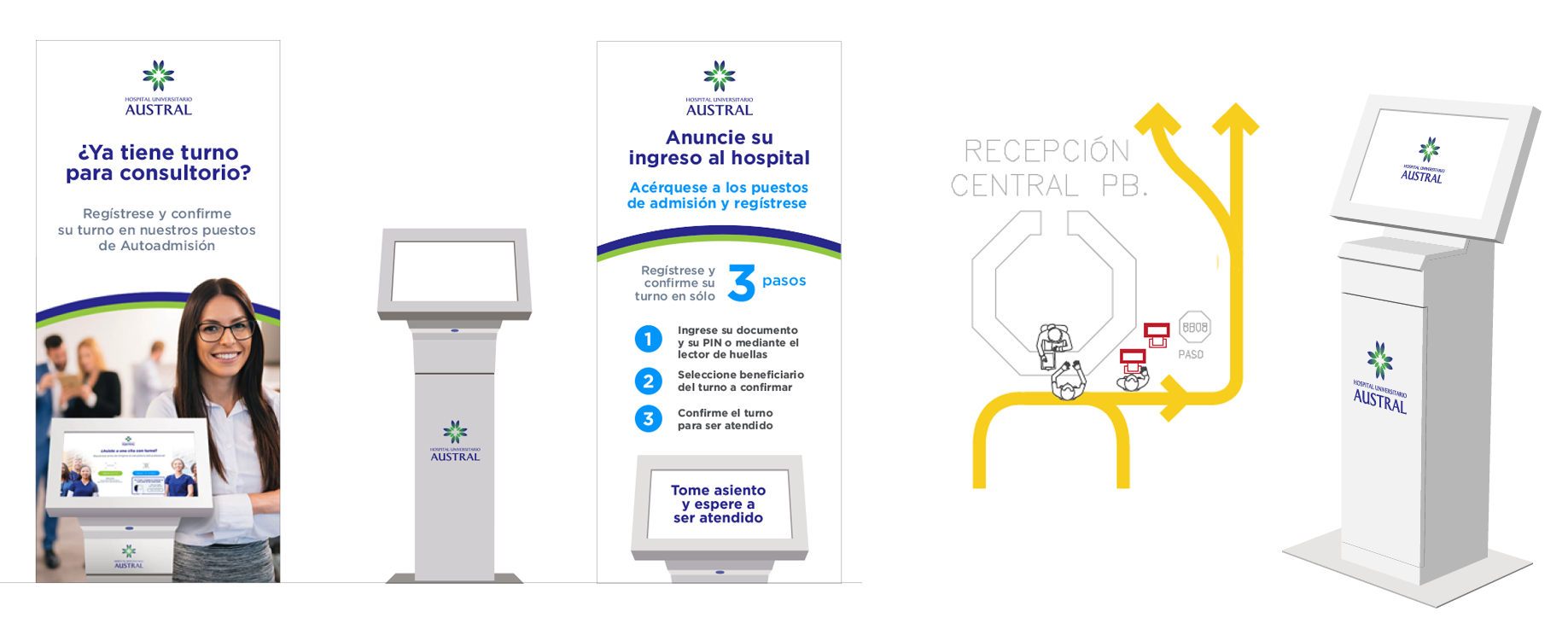
UX Design Mockups
Final Design Screens Assets
Our Work
We have designed its interactive totem user interface, backoffice web site design and demo reels.