strix flotas
A web and mobile app that manages, administers and monitors vehicles or mobile devices.
A fleet management software solution focused on usability and user experience
Strix is a family of solutions that manages, administers and monitors "things" or entities, such as vehicles or mobile devices (GPS, phones, key-ring localisers), in real time, generating alerts on preset events and allowing the analysis of the information obtained to improve different types of processes or subsequent actions.
INTRODUCTION
Our main objective was to understand the product, and familiarise ourselves with its current/potential users and its characteristics, since the product is marketed in several countries.
THE IDEA
The first task was to find out what strategy our client wanted to follow:
What is their target?
What needs do they have?
What product or service do they have to offer and where?
What are the characteristics of their product/service? Who is their competition?
What is their differential value?
Strix's solutions are based on the same internet of things (IoT) platform, internally known as Magenta. Each solution applies to a vertical market and is composed of one or more products. In turn, each product is made up of one or more features and each feature can also include or depend on other features (the latter are also known as capabilities or enablers).
The team behind the process involved marketing, sales, product and IT personnel from Lo/Jack's team and designers, architects and engineers on the Leapsight's team. This 'cell' developed this new solution together using our agile processes and methodologies.
Behind every successful product, there is a clear strategic vision that takes into account the market and the customer's needs. Essentially, strategy is the set of choices a company makes to achieve its objectives'. These options include which products to develop, which market segments to focus on, how to differentiate yourself from the competition, how to calculate the price, how to position yourself and much more.
The only information we had related to the product was the product itself. So that became our starting point: to get to know it and other, similar products from the competition. Our first step was, then, to try to define the issues and targets from our client's point of view. That made it essential to understand the platform's users, mainly those who interact with it for up to eight hours at a time in front of a screen: the monitoring operators.
Methodology
We planned our steps using what we call our design thinking model:
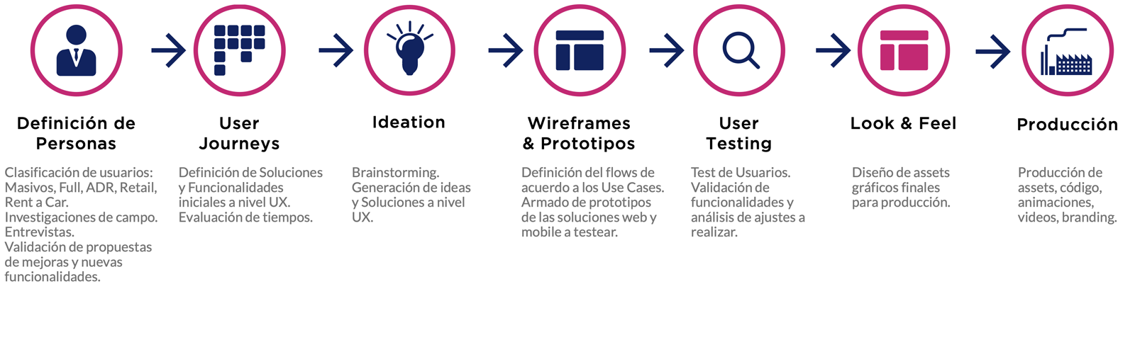
User Research and Ideation
We interviewed users with different profiles, to better understand their perspective on the topics presented. This helped us to resolve specific problems related to the UX and UI of the current platform. We discovered that many people were not using 100% of the tool's functionalities because I don't know how to use it', or because they considered some of the features irrelevant.
All these points were taken into account and documented on a spreadsheet and shared with the client in Notion, a tool for writing, planning and organising digital projects, used by both the Leapsight and client teams. Using this research, we began the ideation process, where we reviewed and analysed the product's problems (detected by us, our client or its users through the interviews).
Pains and Goals from the UX point of view
User Research and Ideation
Among the problems that we detected in the application, we highlighted that:
- entity locations on maps were confusing" they wanted the entity marker to change according to the zoom level.
- they needed point-of-interest layers as geolocation references for drivers.
- they needed real-time geolocation of the "things", or at least more frequent position reports.
- reports were complicated (only 10% used this feature, the rest mostly didn't know how to use it).
- positions in maps were not precise (especially for street turnings).
- there was little use of features, due to ignorance or lack of understanding.
- the menu interface was confusing and processes were not clear or there was not enough information on how to follow them.
Improvement opportunities
Some of the possibilities for improvements that we analysed were:
- visualisation of entities on maps in real time (entities are not only shown on maps, they are also "live").
- simplification of the interface (we would only show elements on demand or when needed, e.g. points of interest should be shown in a different layer).
- simplification of map displays, drastically modifying the applied colour styles.
- optimisation of colour palettes to guide the user.
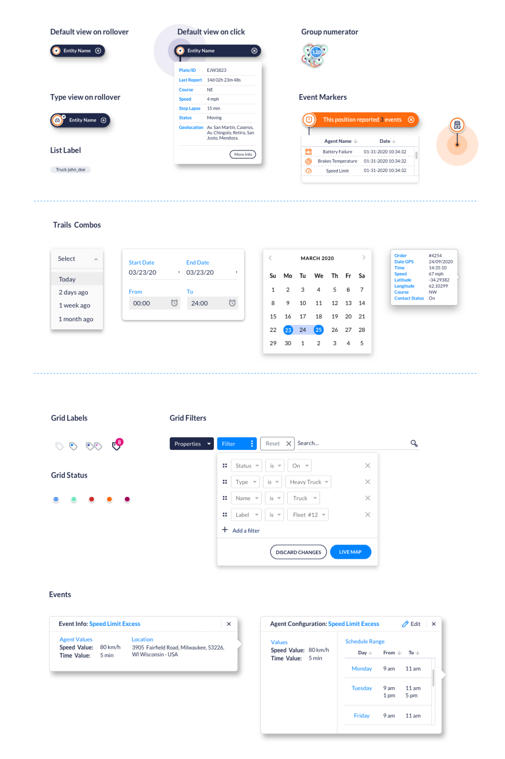
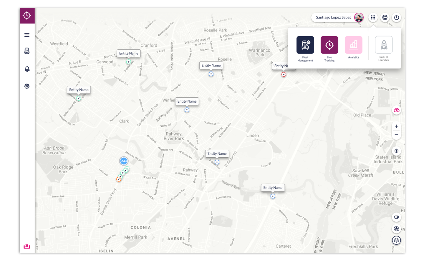
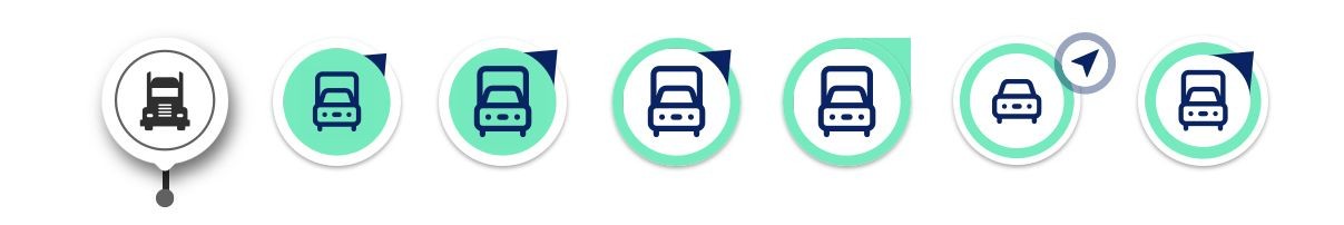
- identification of each "thing" on the map through a new iconographic system, providing extra information, such as status (stopped, moving, on, towed or battery failure), orientation and, within a specified zoom level, indicators displaying the number of entities in a particular area.
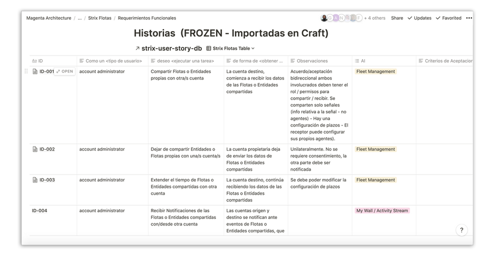
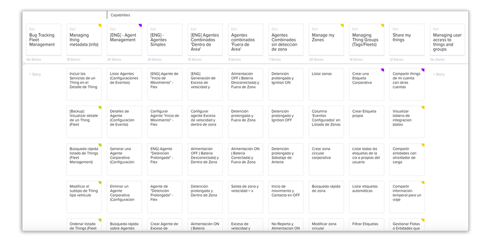
User journeys/stories and ideation process
Notion's spreadsheets helped us record, order and visualise all the issues that we had to take into account in order to categorise them according to ideas, proposals, priorities, effort, relevance, estimated development time and people involved, to use in stories, which were put into Craft, another of the project management tools used with the client.
Although its main use is to expose functional issues to our client, we actively participated in the process of developing the what and how to make them visible.
This process was constant and changing, since the definitions and their adjustments directly affected the visualisation structure that arose from the design and the user experience, e.g. what the user registration processes would look like, where to manage them from, conditions, labelled entities, entity information display modes and traces.
These are some examples of functionalities that were adjusted based on new ideas, customer feedback, opinions or suggestions from the user tests carried out.
Starting the Design Process
Mockups
High-fidelity prototype
Accessibility
THE DESIGN SYSTEM
A design system is the single source of truth that groups together all the elements that will allow our team to design, realise and develop our product.
ABOUT DESIGN SYSTEMS
The fundamental purpose of this design system is to facilitate the work of our team. Once our target is defined and we have an initial idea of what is already in place in the company, it will be easier to know where to start. The first thing to keep in mind: design principles are so much more than just the visual aspect of a product.
Design principles are the guidelines that help our team to achieve a product's purpose. They will help us to make meaningful design decisions. Aside from producing documentation directly related to the system, our team will also seek ways to ensure best practice. We will explore general best practices and extract the most relevant to the product and our team, which will help us form and develop our technical skills.
A design system is a full product that will help project stakeholders build other products.
As with every good product, it will have its own backlog and will have to build itself in an iterative way, keeping its users (designers, developers, PO, etc) at the heart of its approach. The more integrated a system is into designers and developers' workflows, the more effective it will be.
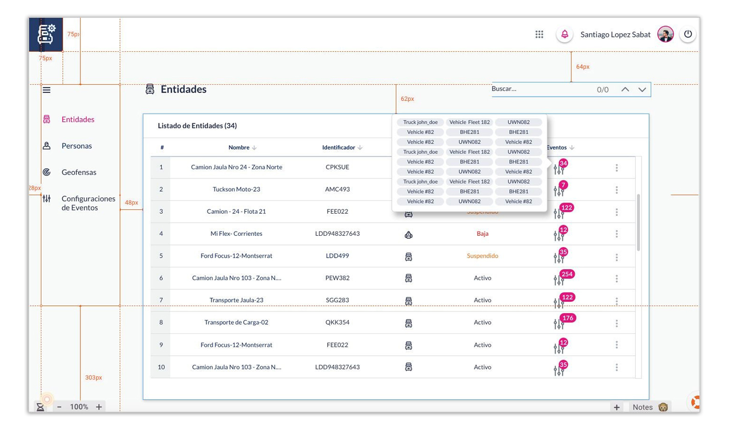
Wireframes
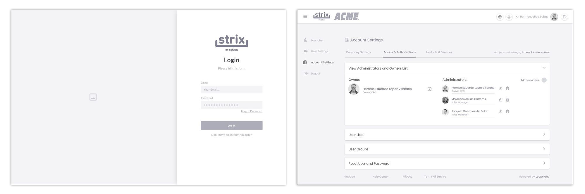
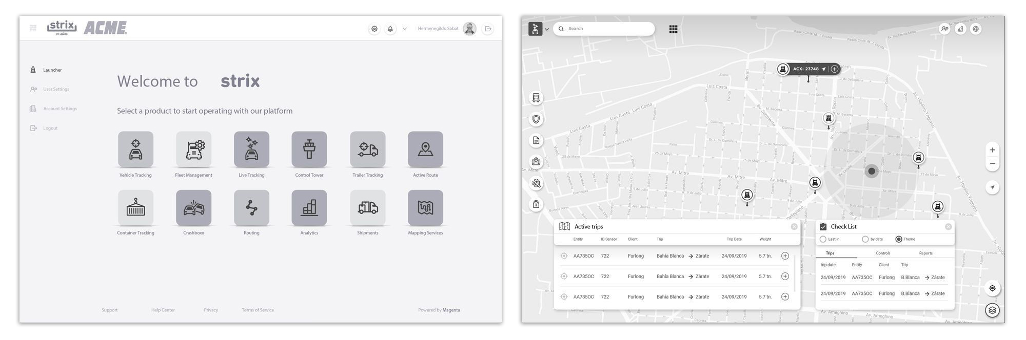
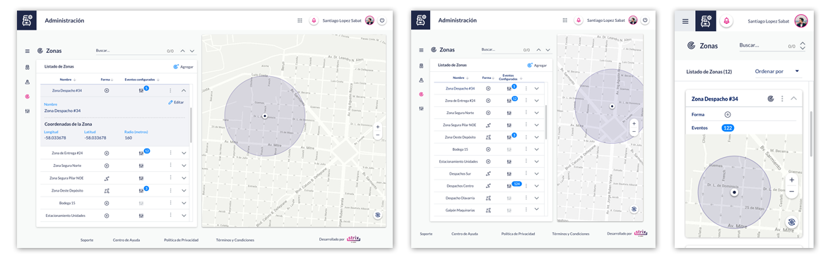
Once the initial desired functionalities for the MVP (minimum viable product) were validated by the client through user stories, we began to work on the visualisation and usability of the tool. The first thing we considered was navigation, since Strix has produced a solution that includes different embedded products, which the client contracts according to its needs.
This means that a user, when logging in, can select which product to use and is able to switch between the products, if necessary.
strix flotas initial wireframes
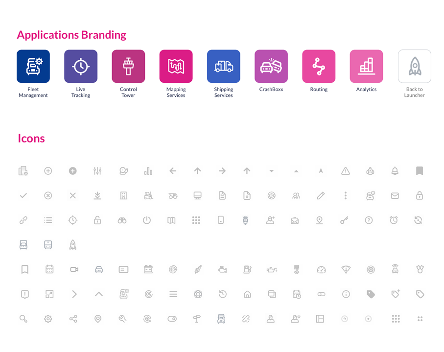
Our first visualisation concepts: Products Launcher
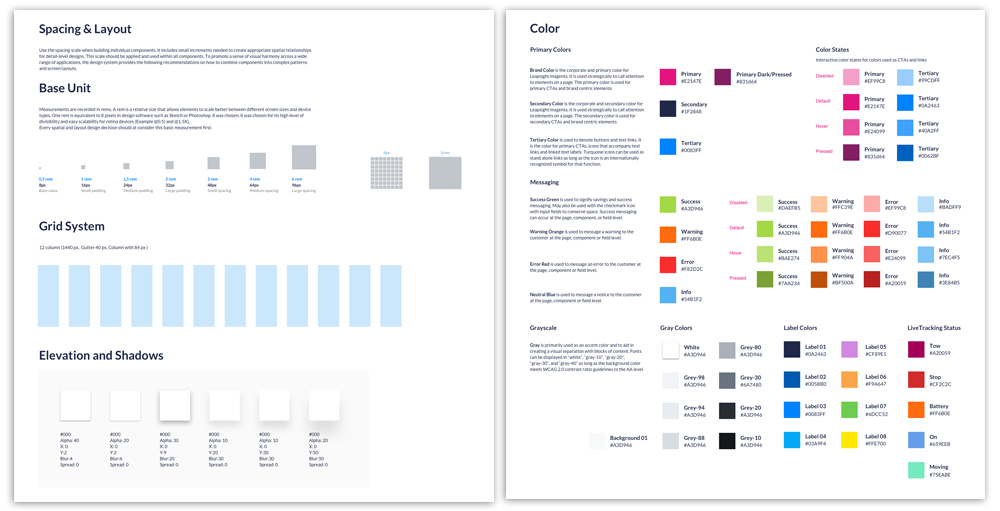
Spacing, layout grid, text styles and colours
Design components
Mock-up design
Once the final adjustments in the wireframes were made according to the required user stories, we began to test the user workflows on a higher quality screen. It is not only a black-and-white interface, but also based on the components designed according to our system.
These screens also serve to make interactive prototypes for tests with users.
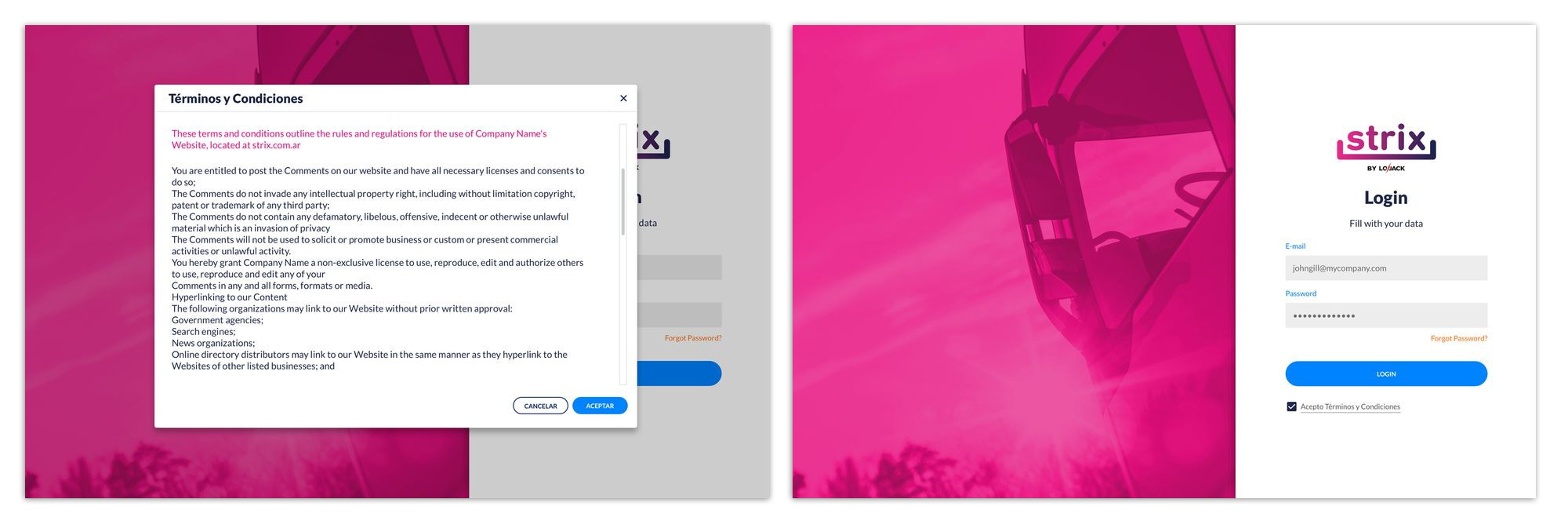
The mock-ups include not just the main workflow screens, but also those that the client sees only very occasionally (eg change of profile photo, account reset, etc). Differences in device resolution are also taken into account, from desktop to mobile (responsiveness).
Example of responsiveness applied to a web page
User Settings pages
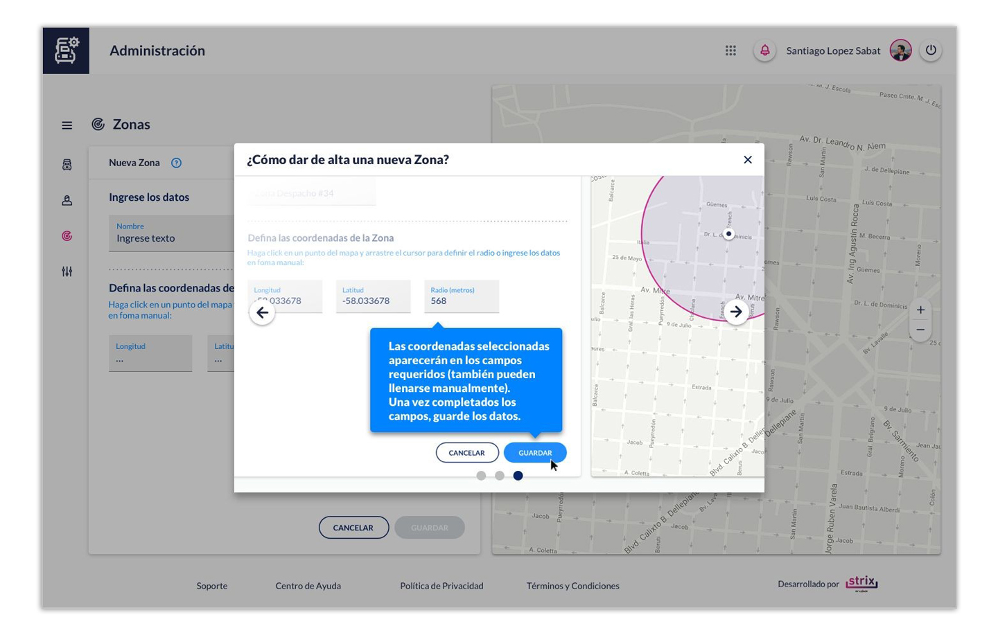
Fleet Management pages
Live Tracking pages
Iconography design
Marker design evolution
User Testing
Designing for our final users.
PRIORITY TOPICS
User testing is at the core of prototyping; getting your prototype into the hands of real users (in this case, monitoring operators) who need your product is essential.
VALUE
We ensure our product has a real purpose. Does it solve the user\s problem? Does it help to fulfil a need? At that point we realised the target product could offer more value than the incumbent system used every day.
USABILITY
In today's world, products cannot just be functional. They must be intuitive, user-friendly. Typically, you test the Value and Usability at the same time.
We made sure our team could build the product. This is where the role of the cell was fundamental, since it was up to the client to understand how the user wanted to use the product. The role of the development team was also important, as it defined the technical development.
Through testing, we found out what our users wanted to obtain from our product or app. The best results came from listening carefully to customers and seeing how our users tried to use our product prototypes. We asked them to use the product to achieve something specific. We analysed where they got stuck and what seemed unclear to them; we listened to their comments, what they were waiting for, what other functions they would like to see, what they found frustrating and why.
We used this feedback to create new versions of the prototype and retested with users. This cycle of rapidly building new prototypes and testing them with users was the key to effective product discovery and helping the team find the right product to build
Final results: Pre-production graphic assets
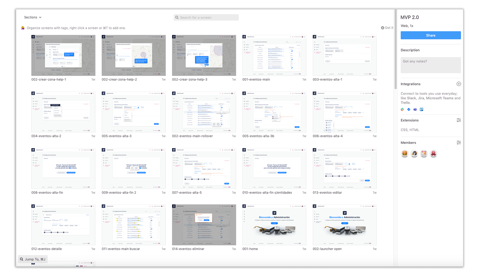
Our final step was to develop all graphic and code assets needed by the development team: graphic assets in different formats (vector/svg, bitmaps, html code, css); and reference documents on platforms such as InVision (for interactive mock-up and presentations) and Zeplin (for more detailed specifications of each asset-size, distance between components, colours, transparency, state, etc).
Example of web page mockup published in InVision App
Example of web page mockup published in InVision App
Example of web page mockup published in Zeplin.io