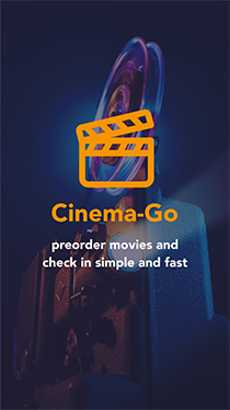
cinema-go
A showtime check-in app for a movie theater.

Value Proposition
- Pre-order tickets and food and check in into the cinema with your purchase ready.
- Wherever you are, using any device.
- Easy to use.
- Avoid waiting in lines. With you check-in code, everything is faster.
- Eliminates stress and long lines by paying at home, saving time.
- Your mobile phone is your ID: Show your QR code and avoid showing document or tickets.
- 100% secure: your code transaction is unique.
- It's free.
INTRODUCTION
The app will let users pre-order and pay tickets and food, food, avoiding standing in lines and checking-in easily and faster.
THE PROBLEM
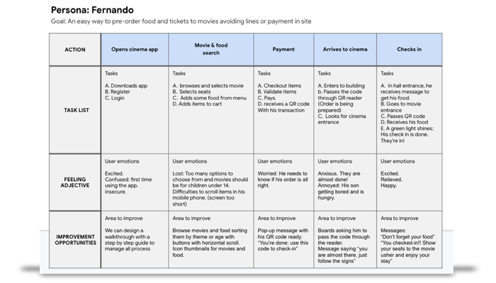
People want to go to the movies pre-ordering tickets and include the purchase of food because they hate to wait in long lines (especially with children) and doing payments at the cinema. By pre-ordering tickets and food with the app they will then be able tocheck-in without making any lines an avoiding payment in the cinema.
THE GOAL
The goal is to check-in faster and including his meal at the same time using an app that manages all the transactions. The limitations could be users with little experience using apps, so we are including a walkthrough describing and explaining every step. The other limitation is wi-fi connection.
Our Work
We needed to find out how users react to our app, so we took into account challenges such as ordering online, payment, and using a QR code to check in at the cinema.
RESEARCH
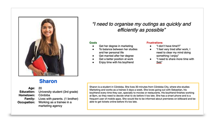
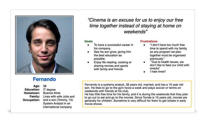
We conducted interviews and took notes to create our Personas and Empathy maps and Diagrams to establish Pains and Goals.
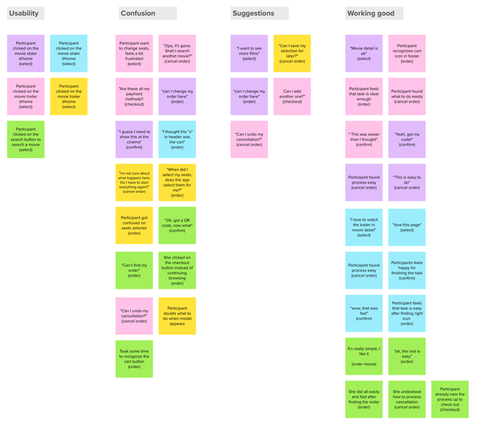
Usability
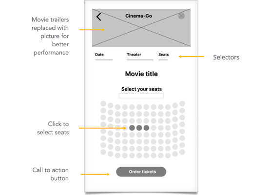
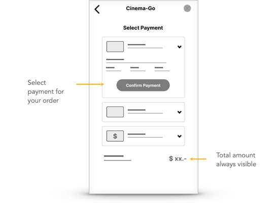
Many participants had problems selecting seats for a movie. This means that we must offer an easier way to select seats.
Usability
Many participants had problems finding and using their orders. This means that not everyone is familiar with footer menus and using icons.
Access
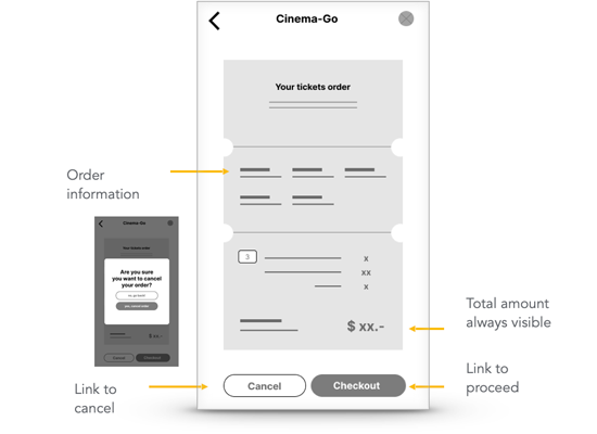
Many participants got lost when trying to cancel an order. This means that we must adopt a simpler path to process a cancellation to make it clear enough.
Knowledge
Many participants got stuck after receiving their QR code. This means that not everyone is familiar with this kind of codes.
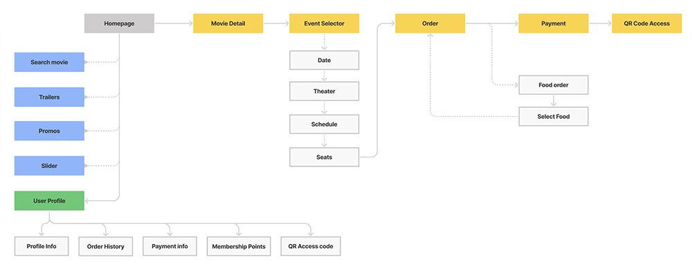
Architecture Information
We analized our architecture information Map which organizes content to help users understand where they are in a product and where the information they want is. Information architecture is the roadmap for users to get everything they need from the product you're designing.
User Journeys
A user journey is the series of experiences a user has as they achieve a specific goal. User journeys built off the personasand stories we've already created. They helped us think and feel like the user, which is super important.
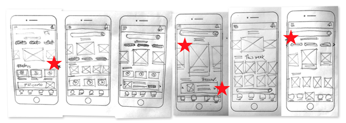
Paper Wireframes
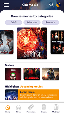
In the home page, we prioritised the best way for users to select a movie easily and fast, through a slider.
Other secondary elements were added in different levels of importante and lecture.
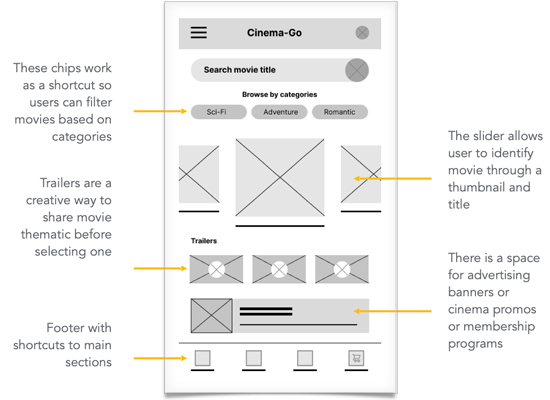
Digital Wireframes
Then we started designing pages based on users feedback and recommendations, based on previous experiences using similar apps.
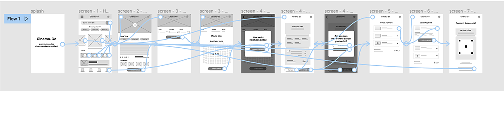
Low-fidelity prototype
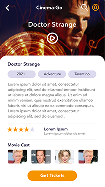
The initial low-fidelity prototype included basic user flows to select a movie, pre-order it, make a payment, and receive QR code for checking in at the cinema.
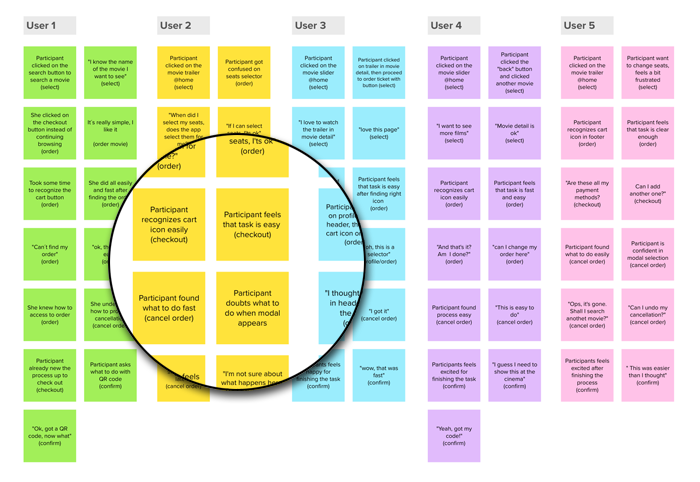
Usability study: Findings
ROUND 1 FINDINGS
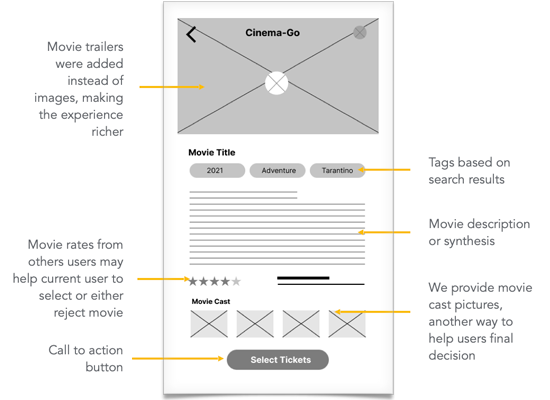
- Users need other ways to visualise movies before selecting them.
- Users need easiest ways to select seats.
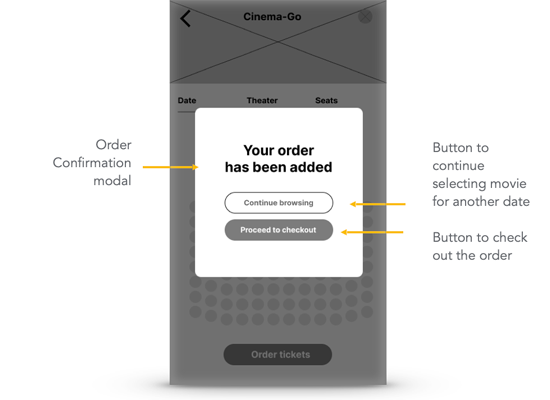
- They need a clear navigation in order to identify their cart more efficiently.
ROUND 2 FINDINGS
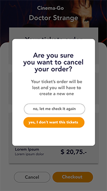
- Users need to be guided in the cancellation process by changing wording or flow.
- They need to be instructed in how to user QR code with a tutorial or text.
Refining the design
Mockups
High-fidelity prototype
Accessibility
Mockups
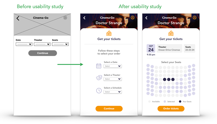
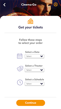
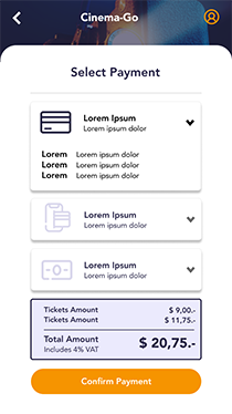
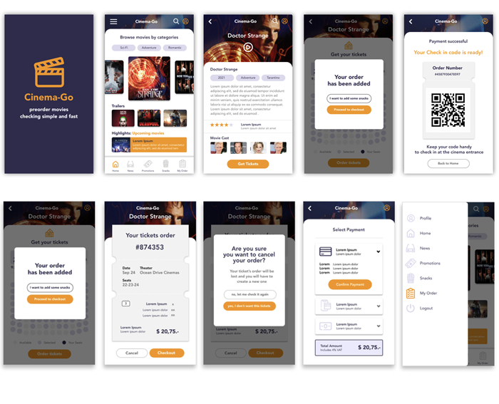
Users need easiest ways to select seats when ordering tickets. We changed the flow by adding a page and dividing the steps in two: first to select date and cinema and finally seats selector. We also changed wording for better understanding.
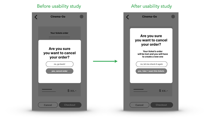
Users need to be guided in the cancellation process by changing wording or flow.
We changed all the wording to make clear what "cancelling" is about, adding a warning message in order to make final decision clear.
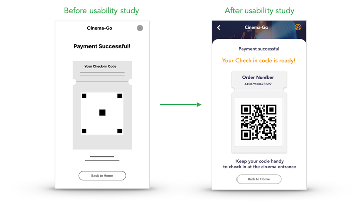
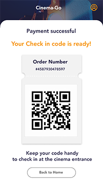
Users are not always familiar with codes and, need to be instructed in how to them with a tutorial or text We change texts explaining what to do with the QR code and when to use it.
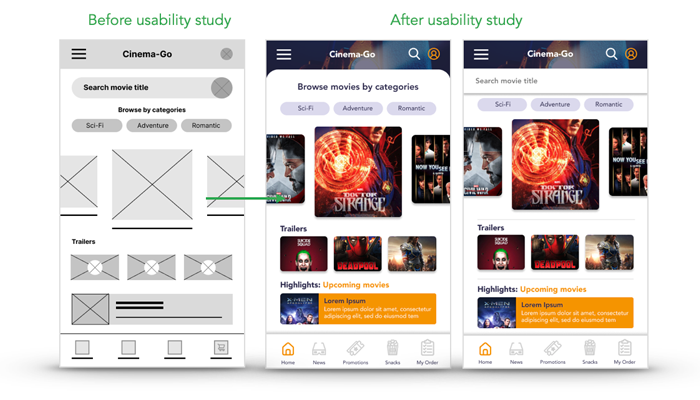
Only one user selected a movie from the search placeholder, so users need other ways to visualize movies before selecting them.
We replaced the "search" placeholder with an icon in the header, so users can activate it when they prefer to search a movie by its title.
High-fidelity Prototype
Accessibility Considerations
Users need to be guided in the cancellation process by changing wording or flow.
We changed all the wording to make clear what "cancelling" is about, adding a warning message in order to make final decision clear.
Users need easiest ways to select seats when ordering tickets
We change the flow adding a page and dividing the steps in two: first to select date and cinema and finally seats selector. We also changed wording for better understanding.
Users are not always familiar with QR codes and, need to be instructed in how to them with a tutorial or text
We change texts explaining what to do with the QR code and when to use it.
Going forward
Takeaways
Next steps
TAKEAWAYS
"I love it!!"
"So? I'm done? That was fun"
"Really easy to use"
"Simple and smart way to improve my check ins"
WHAT WE LEARNED
I learned how important user research is to gain information about how they interact with products, what to take into account, how to prioritise what they really need and how to test our design proposal the most accurate ways as possible.
NEXT STEPS
Continue improving our user flow and testing it.
Complete the missing functionalities, like user settings, how to join membership programs, and food store flow.
Prepare iOS and android versions. See how to sell the app to stakeholders I the market. Promote our app and sell advertisements.